I’ll pick a city more or less at random. Let’s say Denver.
Now a date and time in the past. How about September 3rd, 2017, at 4 pm.
If you lived in Denver and had some solar panels, how much sun hit them on that date, at that time? Let’s find out. (I’m not cheating—I’ve never looked at sunshine in Denver, and I’m curious. I would guess it’s pretty sunny.)
NREL (the National Renewable Energy Laboratory, in Golden, Colorado) has built a massive online resource called the National Solar Radiation Database. (Like many of these resources, it’s so massive that it took me quite a while to find the particular part of it I wanted, and how to get it.) It has nice interactive viewers that are fun to play with, but those won’t answer my question, so I need access from code. For that, you go to this page and request an API key that allows you to query the data. It’s free, which is appropriate, because we tax-paying U.S. citizens paid for it—every bit of it.
I’ll be working in Python, so I need to install a Python environment. For this purpose, I’ll use Anaconda, which is popular with the data science crowd. With one install, you get tons of extras, some of which I’ll need, like the Pandas and Numpy libraries for working with large datasets. By the way, I’m doing this from a geriatric refurbished Dell laptop, and everything runs fine.
I’m going to show some Python code, which I’ll break into functions by purpose. I’ll post the whole program somewhere, maybe on github (when I get around to it, unless someone asks for it before then). This NREL product is built around internet URLs that you can request from your computer and get back chunks of text data. First we tell Python what libraries we’ll be using:
import h5pyd
import numpy as np
import pandas as pd
from pyproj import Proj
import dateutil
Now, assuming your name is Joe Example and you’ve signed up and gotten an API key, you can request a years’ worth of solar information at one location:
def get_solar(lat, lon, year, outfile):
    print(f"getting solar data to file {outfile}...")
    # see https://nsrdb.nrel.gov/data-sets/api-instructions.html
    api_key = 'paste_joe_examples_api_key_here'
    attributes = 'ghi,dhi,dni,wind_speed,air_temperature,solar_zenith_angle'
    year = str(year)
    leap_year = 'false'
    interval = '60'
    # Specify Coordinated Universal Time (UTC), 'true' will use UTC, 'false' will use the local time zone of the data.
    # NOTE: In order to use the NSRDB data in SAM, you must specify UTC as 'false'. SAM requires the data to be in the
    # local time zone.
    utc = 'false'
    # Your full name, use '+' instead of spaces.
    name = 'Joe+Example'
    # Your reason for using the NSRDB.
    reason = 'energy+evaluation'
    # Your affiliation
    affiliation = 'none'
    # Your email address
    email = 'joe@example.com'
    # Please join our mailing list so we can keep you up-to-date on new developments.
    mailing_list = 'true'

    # Declare url string
    url = f'http://developer.nrel.gov/api/solar/nsrdb_psm3_download.csv?wkt=POINT({lon}%20{lat})&names={year}&leap_day={leap_year}&interval={interval}&utc={utc}&full_name={name}' + \
          f'&email={email}&affiliation={affiliation}&mailing_list={mailing_list}&reason={reason}&api_key={api_key}&attributes={attributes}'
    print(f"solar request url: {url}")
    data = pd.read_csv(url, skiprows=2) # there are 2 rows of metadata at the top that we don't need
    data.to_csv(outfile)
Next, we need a latitude and longitude for Denver. Google Earth makes that easy. Just navigate to any old spot in Denver, make a place mark (push pin), and right-click to view properties:
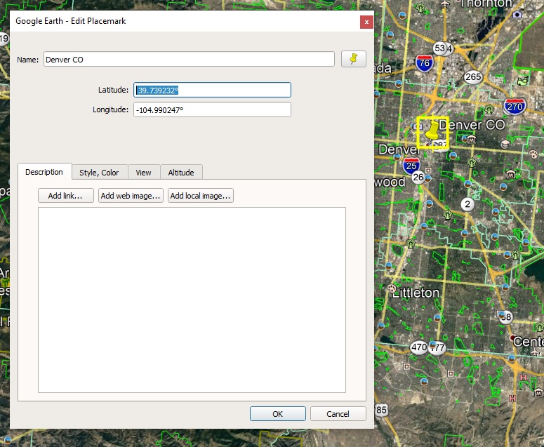
Grab those numbers: 39.739232 and -104.990247. Google gives us decimal degrees, which is what we need (not degrees/minutes/seconds). The only other parameters are the year (we want 2017) and a file name to save it to, so we call our function like this:
get_solar(lat=39.739232, lon=-104.990247, year=2017, outfile='c:/joe/solar/denver_solar.csv')
(I did cheat on the year—2017 is the most recent year in this dataset.) If you run this and open the file, it will look like this:
,Year,Month,Day,Hour,Minute,GHI,DHI,DNI,Wind Speed,Temperature,Solar Zenith Angle
0,2017,1,1,0,30,0,0,0,2.2,-2,162.33
1,2017,1,1,1,30,0,0,0,2.3000000000000003,-2,155.19
2,2017,1,1,2,30,0,0,0,2.2,-2,144.86
3,2017,1,1,3,30,0,0,0,2.2,-2,133.56
4,2017,1,1,4,30,0,0,0,2.2,-2,122.04
5,2017,1,1,5,30,0,0,0,2.4000000000000004,-3,110.65
6,2017,1,1,6,30,0,0,0,2.9000000000000004,-3,99.66
(lots more data follows...)
The first line defines the fields. The data lines are at one-hour intervals— the first data line is for January 1st, 2017 at hour 0 and minute 30 (12:30 am). The solar data is in the fields GHI, DHI, and DNI. (Unsurprisingly, all are zero at a half hour past midnight.)
DNI is Direct Normal Irradiance. This is the incoming energy per unit area (watts per square meter) that is coming from the sun in a straight line (not scattered by clouds, etc.) and is measured at a surface at right angles to the sun at that moment. So this would be a good estimate of solar energy hitting a heliostat—a solar panel that rotates throughout the day to always point directly toward the sun. These are also referred to as “tracking arrays” or “trackers.” They collect the most energy per square meter of panel, but are becoming less common, because panel prices have dropped considerably, while mechanical gadgets to move the panels in sync with the sun cost about the same as ever.
DHI is Diffuse Horizontal Irradiance, which is the solar energy hitting a given horizontal area that did not come straight from the sun. So on a clear, sunny day, this is very low, but on an overcast day it can be much higher.
GHI is Global Horizontal Irradiance, a combination of DNI and DHI. It represents the total solar power hitting a horizontal surface. Since the sun is rarely directly overhead, the DNI part is “pro-rated” by the angle of the sun at that moment:
GHI = DHI + DNI * cos (Z)
where Z is the zenith angle, which measures how far off the sun is from directly overhead.
So GHI is a good estimate of the power hitting a fixed, horizontal solar panel. But fixed solar panels in the temperate part of the world are never mounted horizontally. They’re tilted to point at the sun, to collect more energy. The ideal tilt for a fixed panel is about the same as the latitude of the location. At the equator, flat on the ground would in fact be best, since the average noon position of the sun is directly overhead. At the North Pole, a solar panel should theoretically be tilted 90 degrees, or vertical (though why bother?). We saw that Denver is about 40 degrees north latitude, so that’s the ideal angle there.
You can actually get a decent boost in annual output by moving the panels just twice a year, from a summer tilt to a winter tilt. It seems that the inconvenience, especially if the panels are on the roof, outweighs the benefit for most people. And while we’re on the subject of tilt, most of the rooftop installations I see, which are on flat roofs, are not tilted up by nearly the ideal amount. The practicalities there are a less obnoxious visual profile, and less area to catch gusts of wind.
So we don’t have a precise way to estimate insolation (solar input) on a flat, tilted panel. That can be addressed later, but for the sake of moving ahead, we’ll go with GHI for now as our estimate of solar energy at a certain location and time. It represents the energy available on cloudy days better than DNI, and doesn’t inflate the numbers early and late in the day, when a heliostat does better than a fixed panel.
Just looking at the numbers in this dataset isn’t very instructive, so let’s make some charts.
The first thing I’ll do is change everything to Hour Of Year (“hoy”) format, where the first hour of the year is 0, the next is 1, and so on clear to the end of the year. This will get rid of the irregular month/day/hour business and make plotting simpler. This little routine builds a dictionary with an entry for each day of the year:
def make_data_by_hoy():
    data_by_hoy = {}  # index into data_by_date by hoy
    for doy in range(0, 365):
        month, day = u.calc_date_from_doy(year, doy)
        for hour in range(0, 24):
            hoy = 24 * doy + hour - 1
            data_by_hoy[hoy] =  {'doy': doy, 'hoy': hoy, 'year': year, 'month': month, 'day': day, 'hour': hour}
Next, read the solar data back in and attach the GHI reading at each hour:
    solar = pd.read_csv(solarfile)
    for index, row in solar.iterrows():
        year = int(row["Year"])
        month = int(row["Month"])
        day = int(row['Day'])
        hour = int(row['Hour'])
        ref = data_by_date[year][month][day][hour]
        ref['ghi'] = int(row['GHI'])
(This code is simplified from a larger program that also attaches other kinds of data to the same structure, but I’m leaving that out for now.)
Now for some plotting, which (as usual in Python) is simplified by using a library:
import matplotlib.pyplot as plt

def plot(data, path, start=0, len=0):
    fig, axs = plt.subplots()
    fig.set_size_inches(8, 4)
    data[0:len].plot(ax=axs, kind='line', x='hoy', y='solar_watts', color='red')
    axs.set_ylabel('solar input')
    axs.set_axisbelow(True)
    axs.minorticks_on()
    axs.set_xticks(np.arange(start, start + len + 1, 24))
    axs.grid(which='major', linewidth='0.5', color='black')
    axs.grid(which='minor', linewidth='0.5', color='black', alpha=0.2)
    plt.tight_layout()
    plt.savefig(f"{path}/plot.png", dpi=100)
We’re almost there. What hour of the year is September 3rd at 4 pm? Pretty easy in Python, the answer I get is 5895. Here’s a plot of a week of Denver sunshine starting on September 1st:
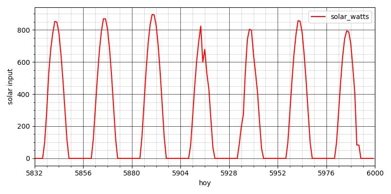
It looks like there were some midday clouds on the 4th. Of course it’s easy to get the code to print the actual GHI number at 4 pm on the 3rd (it’s 332 watts per square meter), but let’s zoom in on that day:
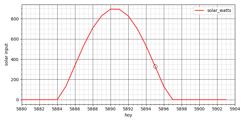
It was a nice sunny day, and at 4 pm the sun’s power was rapidly declining from its noon peak.
Stepping back a moment: that was a fair bit of work, and that’s after I’ve condensed out a lot of the time-consuming/frustrating/educational parts. Why do it? What’s the point of this effort?
Well, our world is full of “climate deniers” and “climate alarmists,” constantly bickering and fighting like cats and dogs. Those groups have one big thing in common, in terms of how they process information: they stand on a foundation of taking someone else’s word for things. There are people who make it their business to average facts, and curate facts, and then someone else takes their work and averages it some more and curates it some more, until at the top layer you get snappy quotes and talking points to be distributed to the troops. This is why there are high-traffic websites and distinguished experts on both sides, making impressive-sounding arguments explaining why the people on the other side are idiots who couldn’t recognize the truth if it bit them. And everyone else chooses whose words to believe, as if they were picking an ice cream flavor, or deciding what sports team to root for.
I suppose this is tribalism at its most biological level. (I’ve read that oxytocin increases feelings of bonding and togetherness with an individual’s in-group, but also increases aggression and distrust with respect to everyone else.) And we seem to be built to admire and follow charismatic leaders, unless we think we have the moxie to be a leader ourselves. So, business as usual, except that as we squabble, our ship of fools is now sailing toward the abyss at the edge of the Earth. (“No it isn’t!”)
Denial is another deep-rooted behavior from the good old days of our species. Once safely entribed, one sets about competing for status within one’s tribal family. Physical beat-downs are no longer fashionable (at least in public), but trying to appear smart by belittling someone else’s opinions still works and feels good. So, denial is multi-layered. I’ve encountered this in the warming-concerned community; everyone there agrees that CO2 emissions are heating the planet, but there are subsets who deny that we need energy storage, who deny that wind and solar are intermittent (if you assume infinite free transmission lines over a wide enough area), who deny that lithium-ion batteries will always cost something, and on and on. I’m sure that if I dig long enough, I’ll find a small coven of 3/8 inch hex bolt deniers. Just another tribal behavior, wanting to be the smartest person in the room.
So as I got more interested in climate science, I started asking myself, “what do you really know?” I read more about the greenhouse effect as it applies to Earth’s atmosphere, and I found that the science there was not very hard, well within my grasp. I didn’t go all the way to the bottom (I’m not sure there is one) but I convinced myself that I actually knew that human-caused global warming is real, and why. It was no longer something I believed because the right kind of person said so.
I also started noticing my thoughts as I read from various authors across the spectrum. I tended to be more convinced by people who expressed themselves well, who occasionally mentioned the limits of their own knowledge, who had a sense of humor, and so on. And on the flip side, I was skimming an article from Scientific American about what kinds of foods prehistoric people ate, and the author used the phrase “to hone in on.” That mistake happens to bug me disproportionately. My first grumpy thought was, “Dumb Millennials and younger can’t even speak English, sad day when Scientific American lets that through editing,” etc.
I noticed and mentally labeled my incorrect ageist thought there, and moved on to: if this person, who writes for a living, thinks it’s so OK to be sloppily unaware about a metaphor, can I really trust what he’s telling me about anthropology? The question has merit, but let’s not get carried away with a minor red flag. It’s entirely possible to be sloppy about English while being precise about other kinds of knowledge.
Now that I’m aware that my mind does this sort of thing, I see it all the time. Pundits on the denialist side do tend to be annoying (to me), but that doesn’t make them wrong. They are only wrong if they get the science wrong, and that’s case-by-case. I’m trying to hold myself to a higher standard now, be more of a hunter-gatherer of truth (exhausting as that can be) than a consumer of highly processed mind-food.
In that spirit, just how raw is this Denver solar data I’ve found? Where does it even come from? Surely there isn’t a solar meter planted at every latitude and longitude in the whole country. That’s true. But what we do have is research satellites, another of the many benefits of Big Government.
If the atmosphere were always perfectly clear everywhere, then we would know how much sunlight would be hitting any given location without doing any field measurements. It’s basically a geometry problem: where is the sun in the sky at that moment, and how much atmosphere does the sunlight have to travel through? What makes it vary is weather. Our Earth-facing satellites collect imagery constantly, and the images can be analyzed for how much cloud cover, haze, smoke, and so on are reducing insolation at a particular spot. This has been cross-checked with on-the-ground measurements to make sure the analysis is correct. Then, we can automatically process the constant flow of satellite images to build the sort of dataset we’re looking at1. I have pretty high confidence in that process.
Another principle is that retail data is harder to fake. By that I mean datasets that are very large, report on many different locations, and are continuously added to. It also helps if you can pull one bit of data out and independently verify it. If you live in Denver, and it’s raining, but the solar dataset says it’s sunny, then something’s off. Faking data of that sort is too hard to get away with. And that same solar data is used for many purposes: architects use it to estimate heat load when designing buildings, farmers and foresters use it to predict plant growth.
The numbers might be a little bit off. In fact, they definitely are, because they come out of an estimate, an algorithm, a model. If you stand in your yard in Denver with a terrifically expensive, super-accurate radiometer, it will never give exactly the same readings as NREL publishes.
But a thing about science that some people don’t understand is that it’s like golf. You make errors and then you make more errors trying to correct them, but over time, you always get closer. The odds that this NREL data is significantly wrong are about the same as the odds that a pro golfer, having reached the green, will pull out a driver and hit the ball 300 yards in the wrong direction.
Next time I return to this subject, I’ll grab some electrical power consumption data to go with it, and perhaps we’ll meet the notorious Duck Curve. Or not—with raw data, anything can happen.
- Overview at sciencedirect.com. “The NSRDB irradiance data have been validated and shown to agree with surface observations with mean percentage biases within 5% and 10% for global horizontal irradiance (GHI) and direct normal irradiance (DNI), respectively.”
Love the way your mind works; inquisitive, detail obsessed, a little pedantic, with a dash of Monty Python. I swear I heard the dear departed Terry Jones shout “No, it isn’t!” when I read that line. Made me laugh.
Keep it up, or should I say- more data!
Thanks for reminding me of that sketch! Now I hear it too.
The Python programming language has that name because its creator was a Monty Python fan.
What you’re saying about second-, third-, ninth-hand information, resonates with me. (I hope the Python coiled at the top of the article doesn’t scare readers away before they get to that.) I feel like a fraud when I debate something, because I become acutely aware that I’m parroting something I read in the New York Times, or wherever. And I don’t have the unwavering belief that properly lashes the talking point to the forensic spear.
You correctly identify the cure as doing the hard work of digging deeper, questioning, and thinking. That quality of rigor also shows up in your “Characterizing the Transducers” post, which is why I think your blog actually has a chance of creating some change.
A laugh of recognition at “to hone in on”–I share that prejudice. The hip cats in the linguistic community say that people create language, and the dictionary follows, so “hone in on” is correct by usage, consensus, and erosion. I get the theory, but I still cringe and object. (Yes, ageism–and “hone” does have the metaphor of sharpening, which kind of works.)
Oh well, it’s a doggy dog world, right?
“I become acutely aware that I’m parroting something” — I would say that’s where the cure begins. Sad that everyone doesn’t feel that discomfort.
“A doggy dog world” sounds good to me right now. Can we put them in charge?