In the last post, I looked at a rule of thumb for estimating the storage a particular region might need. Though useful, a rule of thumb is not an adequate basis for spending billions of dollars—precise answers are needed.
The amount of storage a region needs depends on its conditions. First, imagine a lucky (if unpleasant) place where the wind blows strongly all the time, 24 hours a day, 365 days a year, every year. This place would not need storage, just wind turbines.
Now consider another, equally lucky place where the wind does subside occasionally, but only when the sun is shining. This place doesn’t need storage either; it can keep the power on with solar panels and wind turbines working together.
Such places don’t exist, but the steadiness of renewable resources will vary considerably from one place to another. The amount of demand for electricity through the day and year will also vary quite a lot; hot, sunny places will have a predictable need for power for air conditioning; colder places will be more concerned with heat1. And so on.
So to determine how much storage we need in a region—like New Mexico—to supplement its enviable wind and solar resources, we have to look at specific data, on a fine-grained time scale. Fortunately, we have datasets available to tell us:
- How much solar potential (based on sun angles and clouds) exists at any spot of our choosing, for each hour of some particular years;
- How much wind potential (speed at a particular height above ground) exists, again at any spot of our choosing, every hour2; and
- How much electrical demand the PNM grid experienced during each of those hours.
The Hour-By-Hour Model
Given these three types of data, we can do a simple hour-by-hour simulation. We set this up by assuming we have certain solar and wind resources available at certain places. We define models for output from solar and wind farms that are simple, but not too simple. For example, the wind model assumes power output is linear with wind speed at 100 meters above ground, but that the turbines require 2.7 m/s (6 mph) of wind to begin producing, and must be curtailed to prevent damage when the wind speed exceeds 24.6 m/s (55 mph).
Start at hour 0 (starting at midnight local time on New Years’ Day). We know how many average watts we get from our solar arrays (zero) and how many watts from our wind turbines during that hour. We also know how many average watts PNM drew in that hour (relatively little, in the middle of the night). Demand – (solar + wind) = surplus power. If this is positive, that means we got more power from our wind turbines than we needed—we fix that by shutting some of them down. If it’s negative, we had a shortfall; PNM customers drew more watts than our wind turbines supplied. We fix that by burning some natural gas. (I’m leaving out baseload generation, which could easily be added to the model, but coal and nuclear are both rapidly disappearing from the PNM energy landscape, as they are in many other regions.)
We continue with the next hour of the year, from 1 am to 2 am, and so on. After a few more hours, people begin to wake up, and demand increases as they start getting ready for the day. The sun comes up, and we start seeing power from solar panels, only a little at first, then more. By midday, we might be shutting off some of our solar panels because we have a surplus. By running this hourly process to the end of the year, we can add up important things like how much power we got from wind, solar, and natural gas (and how much CO2 we added to the atmosphere). We can then use this to tailor our wind/solar balance, perhaps adding more of one or the other to reduce the amount of gas we burn.
Now we can add storage (it could be pumped hydro, batteries, or something else—the model doesn’t care). This can also be modeled fairly simply. The storage has a certain amount of energy stored at the start of each hour. The least amount this could be is zero, when the storage is totally discharged. The most it can be is whatever we specify up front as the energy capacity of the storage. Once it’s full, it can’t store any more, even when there’s a surplus; the excess has to be throw away (curtailed). If it isn’t full, then in an hour when there’s a surplus, we can add energy to the storage. Similarly, if there’s a shortfall, and the storage isn’t empty, we can take energy out and put it on the grid for customers to use. But if the storage is empty, it can’t do anything, and the shortfall will be handled by fossil fuel. Obviously, higher storage capacity will increase the capital cost of the storage plant.
We also will specify the maximum rates at which we can store energy, or take out energy. These two numbers (measured in watts) can be different—the design of the storage determines how much flexibility we have. Higher rates are better for the grid, but may be expensive (we may have to have more turbines, more battery cells, etc.) so we’re wasting money if we pay for faster rates than we need.
The model also has factors for the inevitable energy losses that occur when either putting energy into the storage, or taking it out. If we were modeling a battery system, we’d also need a factor for the gradual loss of energy that occurs inside most types of charged batteries even when they’re not being used. Fortunately, EPS doesn’t lose energy when idle, so that factor isn’t included in the basic model.
Now the simulation can be run again, with the storage included. The only time the storage will have no effect is when the demand, and solar + wind supply, are perfectly in balance (or when the storage can’t respond because it’s empty or full). The rest of the time, the storage will be asked to store energy during surpluses, and release it during shortfalls. Again, at the end of the year we can add up usage of the three energy sources (wind, solar, and gas); how much power the storage supplied; and how much less gas was burned with the storage than without it.
Searching For Good Solutions
That’s the basic run of the model, for the 8,760 hours in some particular year. (Multi-year runs, which are important for seeing how well rare weather events are handled, would be a simple extension of the idea.) Next, we can look at optimization, by doing many, many runs, each with different parameters. We can add or reduce solar, wind, and storage as we like. (We could even explore demand changes, due to hypothetical policies like setting a higher cost per kilowatt-hour during peak times, but for now I’m staying with the actual historical record for demand.) By simulating all these different systems, we can find out what combinations do the best job of reducing gas usage.
It wouldn’t be hard to automate the search process. For example, we could add a gradient descent algorithm, where from the best solution after each run, we make small changes to some of the parameters to look for a slightly better one, continuing until we find what we hope is a locally optimal solution. But first, we should learn more about these systems by running some reasonable scenarios and looking closely at the details of their behavior.
Cost Model
Having modeled the physical system, we go one step further, and add a simple cost model. We define a cost in dollars per peak watt for solar arrays, and a similar cost for wind (current and projected numbers for these are easy to find.) The close-enough cost figures I’ve settled on are:
Solar: $1.30 per peak watt, full installed system3
Wind: $1.44 per peak watt, full installed system4
I understand that some would argue that these costs are too high, especially since solar and wind costs are still declining. My response is that different assumptions won’t drastically change my modeling outcomes, and that storage (of any form) also has the potential to drop significantly in price—all of which is great news for the planet, and means renewables + storage systems will cost less than my simple model forecasts.
These are capital costs—the panels and wind turbines are paid for only once, and the power thereafter is very close to free for a number of years.
I’ll discuss the model for storage costs in the next post, when I start modeling scenarios that include storage.
Costs Of Gas
The cost of natural gas is accounted for in two ways. The first is that gas, obviously, is a fuel which costs money. We can add up how much we save by buying less of it. My default number for this is 6.5 cents per kWh. (I’m not including the capital costs of gas generation plants, because they will inevitably be built as backup, and PNM will insist on having lots of backup capacity regardless of renewables forecasts.) The second cost of gas that can be specified is a “societal” one, that is, a simulated carbon tax. This represents how much society (a hypothetical society, not a current one) is going to charge you for the environmental damage caused by emitting one kWh’s worth of carbon (as well as the leakage of raw methane that accompanies gas extraction and handling). I’m using 4 cents per kWh, corresponding to a $100/ton carbon tax, as I computed last time.
All these costs are added to the set of model parameters that we can vary from run to run.
Now we can run many different scenarios to get two bottom-line pieces of information for each: what did it cost to build this whole system? And, how many tons of CO2 did we leave unburned in that year by having this system, compared to the baseline scenario of a 100% gas-powered grid?
What To Expect
With these two numbers, we can start to identify the best solutions, and how good they are:
- In the command-economy angle, we know (e.g. from Renewable Portfolio Standards laws) how much we have to reduce gas burning, so we simply look for the cheapest solution that can meet the goal.
- In the market-driven angle, we assume a simulated carbon tax (such as $100/ton), and find the solution that has the best cost/benefit ratio. Since costs are mostly up-front, but benefits are yearly, another way of saying the same thing is that we’ll look for the system that has the lowest possible payback period, in years.
In either case, we’ll now have a much more accurate number for the cost of achieving a given percentage of carbon reduction. This will be different for each location we might look at, because nearby wind and solar behavior over the year, and demand over the year, will all vary regionally. The best system will look quite a bit different in Minnesota than in New Mexico, just because the solar input is so greatly reduced, especially in winter (due to the lower solar angle). Places that are cloudy will have less reliable solar power than sunny places like southern New Mexico. Southeastern states will get much less help from wind. Storage costs will be different depending on which storage technologies are available in particular areas (EPS can’t be built in flat country). And so on.
Diminishing Returns
As I’ve discussed, the concept of diminishing returns applies to the entire project of using solar, wind, and storage to reduce CO2 emissions. Consider a 100% natural-gas-fueled economy to start with. Now add just one solar panel. In this situation, any time it’s sunny enough for the panel to produce power, that power can be used to burn a bit less gas, because we are always burning gas. The cost/benefit ratio of adding that one panel is as good as it gets. Same if we add one wind turbine—whatever power that turbine generates will be used to burn less gas.
Now add more and more solar panels. At some point, you’ll start to have times when you’re generating more power than the grid needs. You have to curtail, shut off some of the panels some of the time. Your cost/benefit ratio starts to get worse, not all at once, but gradually. The same with wind: if you keep adding turbines, there will be times when you have more wind power than the grid needs. Again, you have to curtail—feather the blades to stop some of the turbines from spinning.
But up until that point, things were great. Solar and wind have gotten quite inexpensive, so the first gas you got to leave unburned was at a nice, low cost.
Once you’re into the curtailment zone far enough, there’s little point building more solar and wind farms. Each new solar panel or wind turbine costs about the same as the ones before it, yet contributes almost nothing. At that point, you need storage, so you start building some.
The cycle begins again. The first bit of storage that comes online gets used every single day, charging and discharging its full capacity. Its cost/benefit is very good. Of course, “very good” is relative, because storage costs more per unit of gas unburned than wind and solar did, back when you first started installing them; that’s just because it’s intrinsically harder to come up with power for the grid without a real-time energy source. Still, it’s as cheap as storage gets. But, being small, it only reduces emissions a tiny bit.
Now, of course, we add more and more storage, and (as I discussed a while ago) there start to be days when not all of the storage is used. Some of the stored energy just sits there. Add more storage, and the utilization continues to drop. Eventually, it becomes extremely costly to prevent the next kWh’s worth of natural gas from being burned, because that unit of storage has to sit idle for a long time before it’s called upon.
Graphically, I’d expect to see something like this (not to scale):

The dots illustrate hypothetical combinations of solar, wind, and storage, to make the point that while there’s a lower limit to the cost of leaving the next unit of gas in the ground, there is no upper limit: you can waste money by building the wrong thing. For example, if you build a very costly storage system with huge energy capacity, but not enough peak generating power, it won’t be able to cover a shortfall adequately, and it’s gas to the rescue. The reverse is also true—if you have only a little storage, and pay to have a huge generating wattage, your system will drain itself in minutes at the start of a shortfall, leaving gas to cover the rest, and you’ve wasted money buying generating power you aren’t using. (And here’s an even simpler example: building lots of wind turbines in places where it’s hardly ever windy.) So you have to design the right system for each situation, but even if you do that perfectly, it’s still true that the more gas you get rid of, the more expensive it gets to get rid of the next bit.
But the curve above is just what I expect to see, based on general concepts. I wrote earlier about the “Raw Data Diet“. I now have a way to generate this curve from real data, and I’m curious to see whether it looks like the one above.
The Model, Environment, And Data
So I run the simple model I’ve described, using PNM demand data, and wind and solar data from near the Capitan site (see below). It starts at midnight of January 1 with the storage, if any, half full, and runs through each hour of the year. We add up things like how much gas we saved across the year by employing wind, solar, and storage, and how much each of those cost.
Here is an overview of the Capitan area, showing the storage plant. In a real situation, we could get energy from any wind and solar farms that happen to be relatively close by, since they will all be on the grid. But we want to include them in our cost model (and this is an exceptionally good area for wind and solar potential). So I’ve shown a reasonably-sized area for co-located wind and solar:

The NREL solar and wind data I’m using in my simulation is specific to the latitude and longitude of the blue square. Choosing this kind of location may be something of a double-edged sword in terms of proving the need for storage, since if there’s anywhere in the continental U.S. that could get by on wind and solar alone, this would be it. This question can be answered by repeating the whole modeling process for some other place5.
Visualizing The Behavior
Here is what the raw hourly output of a typical simulation looks like (for the first 3 days of the year). This is helpful for making sense of how the whole system is behaving:
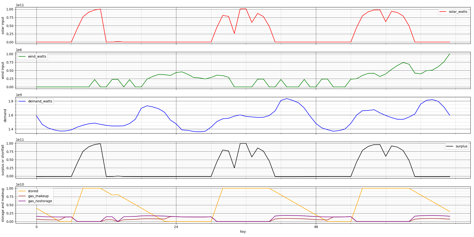
The fainter vertical lines mark 4-hour blocks, starting at midnight Jan. 1. On top, in red, is the wattage from the solar array. The second, green plot is wind wattage. Third, in blue, is total PNM electrical demand. Fourth, the black line shows the amount of either surplus or shortfall—a surplus when wind + solar produce in excess of what the grid demands, a shortfall when the grid wants more than wind + solar produce. (It’s hard to see the shortfalls because the surpluses are so large; I need to modify the chart to show them separately, with different scales.)
In the bottom chart, the two purplish lines show gas burned; one is the gas that would be used with only solar + wind, and the other is the gas used when storage is added to the mix. (This is lower when the storage is contributing, and the two lines match when there’s no stored energy available. The amount of gas burned with no renewables at all would match the blue line (as I’m modeling a very-near-future New Mexico which has stopped burning coal and buying nuclear power.) Also on the bottom chart, the orange line shows the state of “charge” of the storage plant, which typically charges up during the morning when there’s a surplus from the solar array, and then takes up the load when the sun goes down, powering the whole PNM grid (sometimes with help from wind, sometimes not) until the storage is exhausted. (In this case, you can see that there isn’t enough storage to get through these particular nights. A bigger storage plant would do better, but cost more. Furthermore, the storage doesn’t have a high enough generating rate, and so some makeup gas is being burned throughout the shortfall periods.)
It’s Easy To Design A System That Costs Too Much
Experimenting with different combinations quickly shows how easy it is to design poor solutions, which have high capital costs but don’t reduce emissions very much, because they’re out of balance in some way. Here are a few examples that are easy to predict:
1. Not enough storage (with adequate storage and draw rates). On most days, there will be a period of maximum shortfall when the sun sets just as evening demand ramps up (the duck’s neck in the notorious “Duck Curve“). Assuming the storage is full, it will be drawn down very quickly, and the rest of the high-shortfall period will be covered by gas. This is actually a good scenario for storage, in a way: the gas unburned per dollar spent on storage will be maximal, and the storage will be fully cycled almost every day. So the cost/benefit looks great. However, it doesn’t do much to reduce the total amount of gas burned.
2. Inadequate draw (generation) or storage rates. If the storage rate is too low, then even if the storage capacity is large, it will struggle to stay full. The amount of stored energy will tend to bump along the bottom, and storage will be exhausted quickly during high-shortfall periods, causing an early switchover to gas. If the draw rate is too low, the stored energy may be large, but will only cover a small fraction of a high shortfall, so gas will start to be burned immediately when the high-shortfall period starts. So, much of the stored energy sits untouched, while gas is still being burned daily.
3. Too much storage and not enough renewables (solar + wind). Without enough input, the storage will drain to zero in a few days. Then, as in the previous example, the amount of storage will bump along the bottom because there isn’t enough surplus from wind and solar to charge it in the time available. This gets into the realm of “long-duration storage,” which has been getting more attention recently—if you build a system with large storage in hopes of covering more than just daily shortages, it will be necessary to pair it with enough solar + wind to ensure that it stays full, so its entire capacity can be called on when those unfavorable weather periods show up.
Moving on from systems that are out of balance, how does a better-balanced system behave?
Modeling Just Solar And Wind
One point I’ve discussed is that when you first start trying to reduce carbon, solar and wind give the best bang for the buck. This is easy to model. Here is what happens if you start with the baseline scenario (PNM’s 2019 demand, 100% satisfied by natural gas), and start gradually adding solar:

Once you’ve spent around $4 billion on solar panels, you can forego a very respectable 40% of the natural gas you would have otherwise burned. Then the returns diminish rapidly; spending $10 billion gets you a paltry 5% more. That’s because once you have enough solar panels to cover all your power needs during sunny hours, solar can’t do anything more for you. The slight improvement as you spend much larger amounts on solar come from the fact that you can cover a few more marginal hours (clouds, dusk, and dawn) with an enormous area of panels collecting the feeble rays. There is no curtailment for the first four points of this graph—every joule of solar energy collected is used by the grid. After that, you start throwing away energy during peak sunshine hours to get a little more during those marginal hours. (This curve would probably have a softer knee if we examined a place that has a lot more cloudy weather.)
Since our prototype system includes wind collection from a very windy spot, we should look at a similar curve for just wind by itself:

This has roughly the same shape as the solar chart. $4 billion in wind turbines gets you past 50% reduction in gas burned. Because wind energy has a wider dynamic range, and wind can blow at any time, day or night, there isn’t such a sharp knee where you stop getting improvements from additional turbines.
This chart is not entirely fair to wind, because it’s based on wind data from only one location—the further apart two places are, the less correlated their winds will be. The model will be upgraded to support an arbitrary set of wind locations. For now, the takeaway is that wind, like solar, is subject to diminishing returns, as expected.
Since we’ve looked at wind alone and storage alone, it wouldn’t make sense to not look at wind and solar combined. Sometimes it’s windy at night or during cloudy weather, so the two can complement each other. This anticorrelation is region-dependent, so I ran a study to see how it works out for this spot, which is both unusually sunny, and unusually windy:
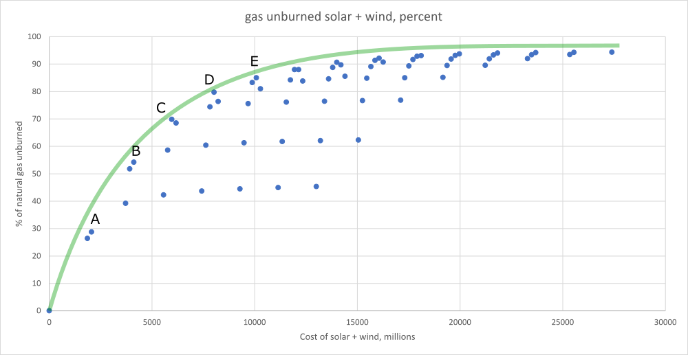
The blue dots are scenarios in an 8 x 8 matrix of different amounts of wind and solar. The green line (fit by eye) is a possible optimum boundary. I’ve labeled some points that are good combinations at different cost levels:
| Label | gas saved | wind cost | solar cost | total cost |
| A | 28.8% | $2.1 billion | 0 | $2.1 billion |
| B | 54.2% | $4.1 billion | 0 | $4.1 billion |
| C | 69.9% | $4.1 billion | $1.9 billion | $6.0 billion |
| D | 79.8% | $6.2 billion | $1.9 billion | $8.1 billion |
| E | 85.0% | $8.2 billion | $1.9 billion | $10.1 billion |
In this particular location, it seems wind is more cost-effective than solar. (Keep in mind that the trade-off will be different in other places.) With enough wind turbines and some help from solar, we can get very high levels of decarbonization—over 95%—from wind and solar alone, with no storage. But at a cost of $15 billion or more, it’s still worth asking whether adding storage can get us there at a better price.
This post is getting too long already, and I haven’t even begun to discuss model scenarios that include storage yet, so I’ll continue in the next post.
Previous: Encapsulated Pumped Storage, Part 13: A First Look At Benefits
Next: Encapsulated Pumped Storage, Part 15: Modeling The Benefits With Storage Added
- The significance of this for the grid will increase as space heating by fossil fuels is retired and replaced by heat pumps.
- There is some risk in relying on hourly average numbers for solar and wind input; for example, an hour in which there are 30 minutes of a steady supply of 100 units of energy, and no energy at all for the remaining 30 minutes, would be reported as an hour with 50 average units.
- https://pv-magazine-usa.com/2019/12/20/utility-scale-solar-power-as-cheap-as-75%C2%A2-per-watt-says-government-researchers/ says “Average of $1.60/Wac (or $1.20/Wdc) for projects completed in 2018. The lowest 20th percentile of projects were priced at or below $1.30/Wac (or 97¢/Wdc), with the lowest-priced projects around $1.00/Wac (or ~70¢/Wdc).”
- https://emp.lbl.gov/wind-technologies-market-report/ is a 2020 update. This says “The average installed cost of wind projects in 2019 was $1,440/kW, down more than 40 percent since the peak in 2009 and 2010.”
- Data note: NREL’s WIND (Wind Integration National Dataset) Toolkit product has hourly wind data for 2007 through 2014. NREL’s’ NSRDB (National Solar Radiation Database) has hourly solar data for 1998 through 2014. The EIA has hourly PNM demand data for 2015 through the present. So, unfortunately, I can’t get data for wind, solar, and demand all from the same year. I’ve chosen to use wind and solar data from 2013, and demand data from 2019. This means I lose any correlations between weather and demand. But that can’t be helped, unless there are other data sets available that I haven’t found yet.